Wednesday, April 28, 2010

The Wire Chair by Nendo

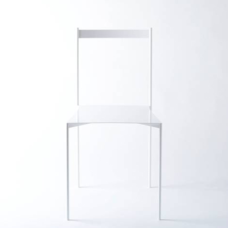
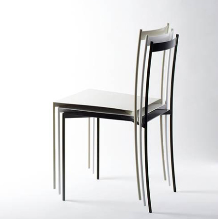
Another beautiful creation by Nendo - THE WIRE CHAIR


This beautiful creation catches my eyes from the very first moment. This beauty is so light and yet able to sustain human weight .. for the obese - i'm not that sure .. Nevertheless, this baby is stackable and it really saves space, will fit perfectly in modern apartments that needed some air to breathe and some spaces to spare.

Read on..

dzn_wire-chair-by-nendo-1.jpg

dzn_wire-chair-by-nendo-2.jpg

dzn_wire-chair-by-nendo-3.jpg

Japanese design studio Nendo will exhibit “wire-chair” at Galleria Antonia Jannone during the Milan design week, starting on the 13th of April.

Here is the text from their press release:

“wire-chair” will be shown at the nendo’s private exhibition “chair garden” at Galleria Antonia Jannone.“wire-chair”
The next generation of the ‘cord-chair’, with its 15 mm diameter legs of stainless steel clad in a hyper-thin wood skin.

The wooden skin has been stripped away and the diameter of the steel rods increased from 9 to 12 mm, giving them the strength to support the chair independently of the wood. Multiple layers of powder coating and hand polishing give the chair a rare lustrous finish, reminiscent of traditional Japanese lacquerware.

The new finish also heightens the chair’s flexibility of use: the resulting durability and water resistance of the finish allow the wire chair to be used outdoors, and the colour selected. These modifications bring fresh charm to an already innovative chair.

The invisibles by Tokujin Yoshioka

The invisibles by Tokujin Yoshioka

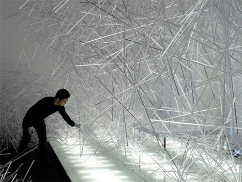
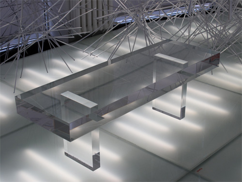
Wanted to know whether is it possible to create an invisible chair? It has already being produced by Japanese designer Tokujin Yoshioka. This amazing piece fits nicely in any space..a perfect camouflage furniture!

Italian furniture producer Kartell will release “The invisibles” designed by Japanese designer Tokujin Yoshioka. These are images of the shop installation “Snowflakes”, which promotes “The invisibles” chairs.

chn11_rpt15133_0413kartel_gallery9.jpg

chn11_rpt15133_0413kartel_gallery6.jpg

chn11_rpt15133_0413kartel_gallery5.jpg

Wednesday, April 14, 2010

Glass Block Make Wonders

House Made “Twin-Bricks” Glass Block by Atelier Tekuto

House Made  Twin-Bricks Glass Block by Atelier Tekuto with modern  lighting system

Design by Japanese Architects atelier tekuto, Twin-Bricks, consists of two wings – the five rental dwelling units and the owner’s two-family house is located in a quiet residential area, just 20 minutes by train from Tokyo. In order to secure some space for the owner’s car collections, the Owner wing (RC Wing) stands nearer to the road than the Rental wing (S Wing). The Rental wing partly has ALC panels as well as glass blocks.

House Made  Twin-Bricks Glass Block by Atelier Tekuto

This building, based on the “Crystal Brick” completed previously, enables these ALC panels, not only glass blocks, as aseismatic elements in order to improve cost-effectiveness. The physical similarity of glass blocks and ALC panels was focused and this structure was realized after a series of experiments. With ALC panels randomly located, walls, columns and beams cannot be clearly distinguished, therefore, an intriguing spatial composition is materialized.

Fresh and Clean Interior Design by Atelier Tekuto

Interior and Bathroom Design -House Made  Twin-Bricks Glass Block  by Atelier Tekuto

The RC wing adopted the “RC structure + exterior thermal insulation” construction method developed at the Atelier Tekuto Co., Ltd., with the purpose of alleviating working noise at the garage and securing privacy and performance of the Owner wing. A huge cost reduction was attempted by using enhanced high-pressure woodwool cement boards and integrating the boards as formworks. Also, original tiles were developed after careful consideration.

Box House Design of House Made  Twin-Bricks Glass Block by Atelier  Tekuto

The contrast between heavy RC wing and light S wing and between glass blocks and ALC panels, both of which show similar physicality while different materials. -via

Michael Laird Architects - Music Venue ABC Glasgow

Let's go party!!

Can't wait to participate there..anyone following?

Club Spaces Nightclub and Music Venue ABC Glasgow

Description

The existing building had already been altered and extended in 1999 by Covell Matthews Architects to provide a series of speculative bar / restaurant / club spaces. Regular music had decided to inhabit the last remaining unit in this complex. Due to the contractor going bust during the alterations some of the Unit 8 had been left in a very poor sub shell condition and much of Michael Laird Architects’ early investigation work involved assessing what needed to be done to consolidate the existing structure. Michael Laird Architects were appointed in June 2004 after a limited competition held by regular Music to design a major concert venue / club on the site of the former ABC Regal Cinema building on Sauchiehall Street, Glasgow. The project comprised the design of two completely different music venues on separate floors, accommodating 1100 and 350 people respectively, four bar areas including VIP and Mezzanine bars, main entrance lobby, various artists dressing rooms and back of house accommodation.

The Spaces Main Entrance

The main entry off Sauchiehall Street retains much of the existing art deco arch with the addition of new entrance doors, box office, illuminated signage and feature lighting. The existing stair and lobby spaces were small and have been kept intentionally simple and functional with clear pale walls and ceilings contrasting the dark floor tiling. Some existing terrazzo floor finishes in the main entrance and stair were restored where possible.

A dramatic corridor space which intentionally narrows as the floor ramps up before reaching a steel clad threshold point that is intended to reorientate the customers before entering the venue. One side wall of the corridor is an exposed brick and steel structural wall from the old cinema, which is contrasted on the opposite side by a sleek, illuminated translucent polycarbonate structure. The large flat ceiling of venue produces a different type of venue space within the structure and contrasts the cavernous nature of the main venue upstairs. The layout of the first floor venue has been planned by Michael Laird Architects to maximize the front of stage / dancing and introduces more intimate areas of fixed seating on a raised floor section while maintaining sight lines to the stage from everywhere. The largest wall which includes the stage recess has been clad using horizontal strips of upholstered timber panels. Opposite this feature wall is the bar, raised seating area and DJ / mixing desk.

The existing plasterboard ceiling and supports were removed to expose the underside of the pitched steel trussed structure above the main ABC space increasing the sense of volume and scale. The area for the crowd is central to the space – the stage being situated adjacent to one end wall – with a new bar and toilet “Pod ” structure at the other. All other back of house accommodation held in the main volume takes the form of a new single storey concrete block structure that flanks the main space on both sides.

The Pod is the main focus in the space containing two bars, toilet facilities and a mezzanine viewing area, as well as the mixing desk. The Pod is a steel and blockwork structure lined with a curving plywood facade made up of horizontal face-fixed ply strips with recessed joints. The highly finished and sharp appearance of the pod contrasts the rough nature of the existing structure that surrounds it. Built as a completely independent structure within the existing volume the Pod embodies our metaphoric approach to dealing with a modern addition to an existing building.

”The ABC itself is a superb addition to the facilities in Style-city. The main auditorium is blessed with great sound and sightlines, the bars and toilet provision generous. It is big enough to feel important and small enough to feel intimate.“ Michael Laird Architects

Interior Design Nightclub and Music Venue ABC Glasgow
Lounge Nightclub and Music Venue ABC Glasgow
Nightclub and Music Venue ABC Glasgow by Michael Laird Architects
Restaurant Nightclub and Music Venue ABC Glasgow
Speculative Bar Nightclub and Music Venue ABC Glasgow

Belzberg Architects - Conga Room

MAKES YOU GO CONGA-CONGA!!


If you go to Los Angeles, United States of America (USA) and want to go to best relaxing place such as night club, Conga Room is perfect for it. We are very interesting with modern glamorous interior design idea which is presented by the building architecture designer Belzberg Architects. The reinvention of Los Angeles’s iconic Conga Room nightclub is an example not in creating the best of an existing room but in totally, completely and absolutely transforming it.


Retro Conga Room Interior

Modern Conga Room Interior

The Conga Room guests enter the night club at ground level building, ascending an ultra modern large staircase design to reach the 1,500 sq m of live music and dancing area, three luxury bars design and a contemporary restaurant decor on the second floor of the complex. The entrance hall might have been rather dull so principal architect Hagy Belzberg decided to provide clubbers a glimpse of the upper floor’s spectacular interior design as soon as they walk through the door.

Wonderfully, this interior dramatic feature is created of hundreds of panels of plywood materials, sandwiched among layers of MDF and painted with white color schemes, fire-retardant semi-gloss. The panels, supported with steel struts, beautifully catch the colored light from a powerful LED system, which synchronizes with the rhythm of the music. Here is it best sample pictures gallery modern Conga Room interior design with luxury glamorous style. -via-

Glamorous Conga Room Interior

Creative Conga Room Interior

Contemporary Conga Room Interior

Conga Room Luxury Interior

Art Wall Decor Conga Room

Thursday, April 8, 2010

REINA BRUJA

Very tasty night club - REINA BRUJA

night_club_design_8.jpg
Reina Bruja is a must visit if you are or will be going to Madrid soon. It is Tomas Alia’s new creation for Madrid’s night life. Light is everything, at reina Burja, the combined use of the light, color and curves makes the space change constantly. The space is never the same, the colour of the light changes, the intensity and consequently, the club.

night_club_design_10.jpg
night_club_design_1.jpg
night_club_design_4.jpg
Tomas Alia is one of the most famous creators of trends in Spain. His fame is due to his capacity to mix harmonically ethnic and traditional objects with avant-garde materials, like the magic focus on the lighting. He received in 2000, the National Prize for Interior Design.
night_club_design_3.jpg
night_club_design_6.jpg
night_club_design_9.jpg
night_club_design_11.jpg
night_club_design_12.jpg

Tuesday, April 6, 2010

Trends Interior Design 2010

Trends Interior Design 2010
Positive Vision

Earth’s elements linked to the earth’s resources are reflected in colours deriving from plants, minerals and dirt. Tones are creating a unique beauty. We’ll find unexpectedly looking colours created from historical natural dye developments such as “baby indigo” and “madder red”. Colours take on high shine lacquers and patents for pale and earth tones. Metal shine is back as metal, not as lurex. Colours become more saturated with a clean impact for maximum contrasts and filled tones. Contrast can be wild and furious, stark or slight. Colours in blocks are a significant way of working with colours. Bright deep darks can deceive the eye. Urban concrete tones become new neutrals. Textiles are developed into still more diversified and specified ones by the end use of them. Sustainability is the imperative keyword.

The continuous efforts to make the production of cellulose fibers more friendly to the environment and the success with which it is met by costumers is a ideal example of how ecology becomes business too. All the ‘having-fun-experiments’, such as dying with beetroot, envelope for returning your polyester shirt, are very important steps in the process of opening the mind of the consumer.

The efforts will turn into sustainable solutions embracing all textile fabrication. The ‘cradle-to-cradle‘ vision is still essential. Performance is one more keyword: maintenance is central in the interior world, temperature adjustment, absorbability, durability, shape memory, etc are appealing features too. Along with the integrated capacities come esthetic and design treatments. Approaches of thinking and production are still aiming to embrace the consumer as part of the creation process - often in products associated to the environmental context.

The expression ‘added value’ when talking about design is still magical.
Trends Interior Design 2010 Sartorial 01
Trends Interior Design 2010 Sartorial 02

Sartorial

A sharp and modern colour palette.
Based on the heritage of know-how, skills and most outstanding materials, added new technology and experience, the luxurious becomes unexpectedly progressive. Craftsmanship is treasured. Intricate elaboration: embellishments, embroidery…
and details are embraced in this story. Our cultural heritage is sensed in the language of ornamentation.
High shine surfaces are emphasized by opaque textures. Luxurious patterns are revisited through a high-tech lens.We see new fibres and material mixes. Hidden performance properties are implemented… with the aim of flattering the desires of man!
Trends Interior Design 2010 Terraneum 01
Trends Interior Design 2010 Terraneum 02

Terraneum

Inspired by the beauty of the earth’s elements, leads to creating a palette of brilliant natural colours abstracted from nature. Sublime texturized surfaces: crooked, scoured, feathery… are picking up on the always overwhelming uniqueness of nature.
Materials are assembled in unexpected ways. Recycled fabrics are magnificent and stylish! A hybrid of earth’s resources and technology…
with the aim of fulfilling the requests of future mankind!
Trends Interior Design 2010 Illusion 01
Trends Interior Design 2010 Illusion 02

Illusion

Modern illuminating techniques are translated into the colouring of textiles. The colours are light-enhanced tones. Shades are absorbed… and blurred… and filtered. Patterns are changing from daylight to nightlight. Patterns are a visual illusion. Patterns are playing with transparencies and opaqueness. Textiles are fluid, airy, layered and unexpected 3-d as to accentuate the illusion. It’s the hymn to the technological discoveries and conquests: smart technology, nano technology, performance abilities… with the aim of gratifying the dreams of man!

Trends Interior Design 2010
Color Usage / Colours

Trends Interior Design 2010 Color Usage Colours 01
Trends Interior Design 2010 Color Usage Colours 02
Trends Interior Design 2010 Color Usage Colours 03
Lenzing
www.lenzing.com

Thursday, April 1, 2010

Island House - Australia

Hideaway Island House in Australia

Courtesy of Freshome

hideaway island house by frank macchia 1 Hideaway Island House in  Australia

In case you wish to purchase real estate in Australia and have loads of cash in your bag waiting to be freed, then we quite simply cannot suggest you a better way to let go of your fortune other than spend it on this spectacular home. Located on a hideaway island in Noosa region of Australia’s Sunshine Coast and designed by local architect Frank Macchia, this scenic home is up for auctioning on January 10 of 2009. The 4 bedroom-4 bathroom house is located on a beautiful island overlooking gorgeous landscape and is lavish and luxurious in design. The interiors are grand and yet elegant making this home a settlement in paradise. – via

hideaway island house by frank macchia 2 Hideaway Island House in  Australia

hideaway island house by frank macchia 3 Hideaway Island House in  Australia

hideaway island house by frank macchia 4 Hideaway Island House in  Australia

hideaway island house by frank macchia 5 Hideaway Island House in  Australia

hideaway island house by frank macchia 6 Hideaway Island House in  Australia

hideaway island house by frank macchia 7 Hideaway Island House in  Australia

Modern Stairs - To Stare & Apply

21 Beautiful Modern Stairs
Taken from Adrian's Corner

Stairs are probably the most utilized elements in most homes. But it is also the element that is least focused on when it comes to renovating or furnishing a home - simply because there is usually no need to spend a large sum of money re-doing something that is already there, totally functional, and usually isn’t an eyesore.

Here’s a collection of some of the most beautiful modern stairs around should you be pondering a change in design for your stairs

WARNING: these modern designs may make you drool. keep a nappy/kerchief close by!


Love the no-rails concept. via Style-Files


via patricia-gray


via momoy


We’re seeing more and more of this type of stairs design cropping up in modern homes. via houzz


Spirals are sexy. via trendir


via livingetc


via decorreport


via archiexpo


Walking up these stairs would feel like stepping on the spine of a vertebrate. via designshrine


The DNA stairs. via dnastairs


via trendir


via markwaldo


Stairs at the YTL residence. via idie4id


Simple and elegant - even looks somewhat like a kiddie playground slide. via ounodesign


Very industrial. But it’s so elegant that I can’t help wanting to feature it. via freshome


Then there’s the one that sits in the Louvre, Paris. Note the elegant underside


via designshoot


via interior-design.s3


via craphound

This I just had to include, simply for the fact that it is a brilliant innovation. These are the stairs that lead to a longhouse (a type of long, narrow, single-room structure built from timber, occupied by many families in a community style living) in Sarawak, Malaysia. These stairs have been carved from one log only. It’s so functional and simple. Hats off to the folks who were innovative enough to design these stairs. via travelpod